 |
| jimmy raheriarisoa |
I like the character and inventive illustrations in this one and think it is easy to read as it flows nicely down the page. I would think it was a poster for an event which would confuse a little and I might not read it as seriously. I like how the program skills are laid out they are obviously an important part of the cv.
 |
Arbrenoir on deviantart
This one shows you immediately the artists skills and you get to view a piece of their work immediately. However I thik it might be frustrating if you are trying to find certain bits of information. |
 |
| Ali Collins |
I like this one and think it shows just enough of the artists style and work to keep you interested as well as showing the information clearly. I do think the colours could be more balanced and the curved text is unecessary.
 |
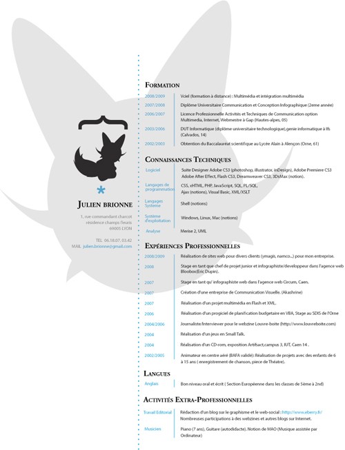
Akashrine on deviantart
I like the cat character and how it shows what style the person works in subtley. I think it is good to have a clear symbol like this an icon of your brand of artwork. It is simple enough but still original and so can be applied to many things. |
 |
| Seamus o'brien |
More of a poster or advertisement than a cv but I still like how handwritten it is, how you can see the texture of the pens and also it shows his skills well.
I think my CV needs to have an example of my work or at least my style in it as this is what the client really wants to know and should be able to see it right away.
No comments:
Post a Comment